What is a Design System?

In modern digital product design, consistency, scalability, and efficiency are critical to delivering exceptional user experiences. But how do teams ensure these factors across diverse platforms, products, and teams? Enter the design system, a powerful tool that has revolutionised how designers, developers, and product teams collaborate.
This guide will walk you through the fundamentals of design systems, two examples, their key benefits, and the core elements that make up a design system. It will also provide tips on how to build your own.

What is Design System

A design system is a comprehensive collection of reusable components, guidelines, and standards that help teams build and maintain a consistent and scalable user interface (UI) across a product or a suite of products. It serves as a “single source of truth,” ensuring that the brand, design language, and user experience remain unified, no matter who is working on the project.
The system includes everything from typography, colour schemes, and UI components to interaction patterns and design principles. It enables designers and developers to work together efficiently, reducing redundancy and speeding up development time.

Examples of Design Systems

In this section, we will provide examples of what a good design system should look like.

1. Google’s Material Design System

Google’s Material Design is one of the most well-known and widely used design systems. Launched in 2014, Material Design provides a rich framework for creating a unified user experience across all Google products and many third-party applications. It offers detailed guidelines on colour, layout, typography, components, and even motion design, making it a comprehensive system that covers all aspects of UI/UX.

Key Features: 
  • A modular, component-based approach to UI design.
  • Motion and animation principles for fluid and intuitive user interactions.
  • A focus on material metaphors, giving depth and physicality to digital interfaces.
Why it’s effective:

Material Design standardises the design language across all platforms and devices, ensuring consistency while allowing enough flexibility for customisation based on individual brand needs.

2. IBM’s Carbon Design System

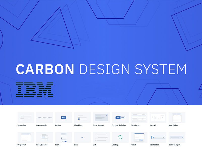
The Carbon Design System by IBM is another prime example of a robust design system. Carbon provides designers and developers with the tools to build consistent and scalable experiences across IBM’s wide range of products. It includes an extensive library of components, patterns, and guidelines on accessibility, modularity, and best practices.

 Key Features:
  • Comprehensive documentation for both design and development teams.
  • Emphasis on accessibility to ensure inclusivity.
  • A robust set of UI components and patterns that can be reused and adapted to different contexts.
Why it’s effective:

Carbon’s modular design and focus on accessibility make it easy for teams to create products that meet diverse user needs while maintaining a consistent look and feel across IBM’s entire ecosystem.

What are the Benefits of a Design System?

A design system offers numerous benefits for teams, users, and businesses. Here are some of the top advantages:
    1. Consistency Across Products:

      A design system ensures that all elements—fonts, colours, buttons, layouts—are consistent across platforms and devices. This leads to a unified brand experience and eliminates discrepancies that can confuse users.

    2. Efficiency and Speed:

      Once a design system is in place, teams no longer need to reinvent the wheel for each new project. Predefined components and guidelines reduce redundant work, allowing designers and developers to focus on solving more significant problems.

    3. Scalability:

      A design system allows for seamless scaling as your product grows and evolves. New features can be added without disrupting the overall design language, enabling you to maintain consistency even as your product expands.

    4. Better Collaboration:

      Teams can work more cohesively with a shared design language and component library, allowing for a unified approach. Designers and developers speak the same “language,” which reduces miscommunication and makes the handoff between teams smoother.

    5. Improved User Experience:

      A consistent and well-structured design system leads to more intuitive user experiences. Users quickly become familiar with the interface patterns, which helps them navigate the product more efficiently and reduces cognitive load.

The Key Elements of a Design System

To build an effective design system, you need to include several key components. Here are the core elements every design system should have:

1. Design Principles

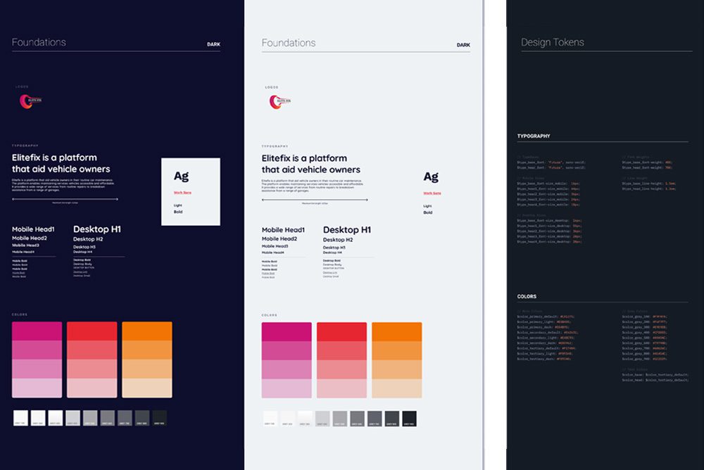
These are the foundational guidelines that influence all design decisions within the system. Design principles ensure that everyone involved understands the core values driving the product’s user experience.

Examples:
  • Simplicity
  • Accessibility
  • Consistency
  • Flexibility

2. UI Components

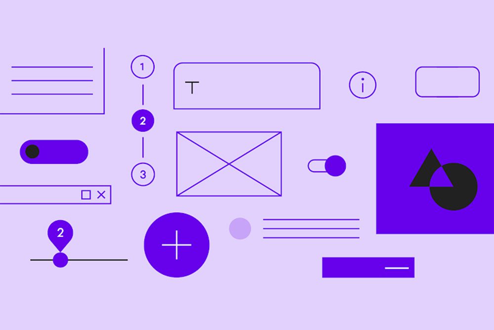
Reusable UI components are the building blocks of your product. These include buttons, forms, navigation menus, icons, and more. Each component should be documented with clear guidelines on when and how to use it.

Examples:
  • Buttons (primary, secondary, disabled, etc.
  • Input fields and forms.
  • Cards and modals.

3. Style Guide

A style guide provides detailed information on the visual aspects of your design system, such as colours, typography, spacing, and imagery. It defines the look and feel of your brand, ensuring consistency across all touchpoints.</p>

Examples:
  • Colour Palette: Define primary, secondary, and accent colours, including guidelines for text and background combinations.
  • Typography: Specify font families, sizes, and line heights for different headings, body text, and captions.
  • Spacing and Layout: Provide guidelines for margins, padding, and grid systems to ensure consistent spacing and layout.

4. Pattern Library

A pattern library is a collection of design patterns that solve common user interface challenges. These are pre-defined ways of solving recurring problems, such as structuring a form or displaying search results.

Examples:
  • Navigation patterns (e.g., sidebar menus, dropdowns).
  • Content organisation (e.g., grids, cards).
  • Feedback patterns (e.g., success and error messages).

5. Documentation

Good documentation is essential to the success of a design system. It should explain how to use each component, when to apply specific patterns, and the rationale behind design decisions. Documentation should be accessible to both designers and developers. </p>

Examples:
  • Include detailed code snippets for developers.
  • Provide visual examples and guidelines for designers.
  • Ensure accessibility considerations are clear.

How to Build a Design System

Building a design system takes time and requires collaboration across different teams. Here are some steps to get started:

  • Audit Your Existing Designs: Start by reviewing your current design assets and components. Identify inconsistencies and opportunities for standardisation.
  • Define Design Principles: Establish clear design principles that will guide your decisions. These should reflect your brand’s values and goals.
  • Create a Component Library: Develop a library of reusable components, starting with the most frequently used UI elements. Ensure that each component is flexible and well-documented.
  • Develop Design Tokens: Establish design tokens for key design attributes such as colours, fonts, and spacing. This will help ensure consistency across all components.
  • Document Everything: Make sure your design system is thoroughly documented so that it’s easy for teams to understand and use.
  • Involve Developers: A design system is most effective when used by both designers and developers. Make sure developers are involved in creating components that work seamlessly across platforms.


Have any project in mind? Let’s work together