Harvesters Academy
Repositioning a learning platform through a structured brand identity and a modern, conversion-focused digital experience.Repositioning a learning platform through a structured brand identity and a modern, conversion-focused digital experience.
Strong training. Weak brand presence.
Harvesters Academy had strong educational delivery but lacked a clear, credible brand identity and digital presence. The platform needed structure, clarity, and a positioning that reflected quality, trust, and progression.
Built for the learner, not assumptions.
Professionally structured. Built for clarity.
The typographic system reinforces hierarchy, readability, and consistency across all touchpoints. Messaging was aligned to position the academy as structured, credible, and results-driven.
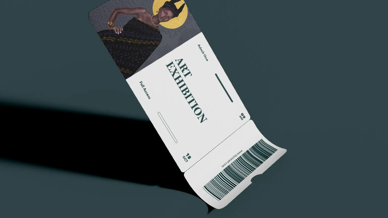
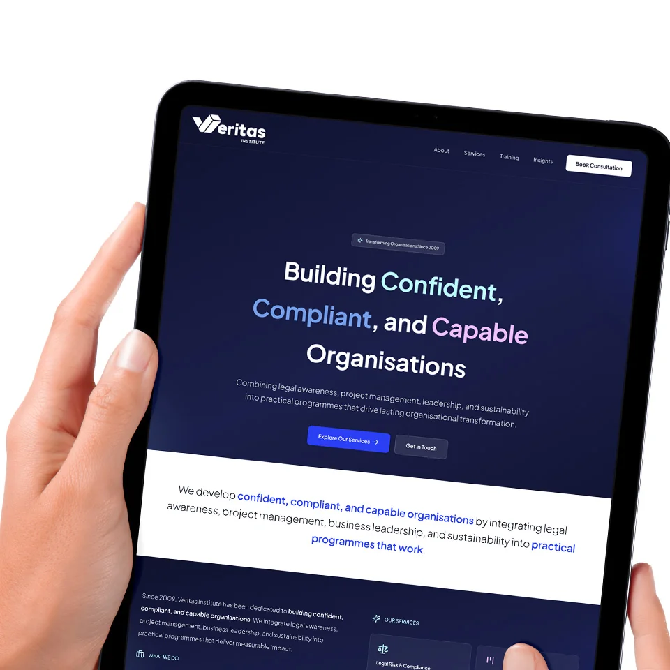
Brand photography & mock-ups
The strategic approach and execution brought clarity to the brand and platform. The result is a structured, credible system that supports growth and engagement.
Build the next move
Start a project if you know what you need. Take the free audit if you want clarity before you commit.