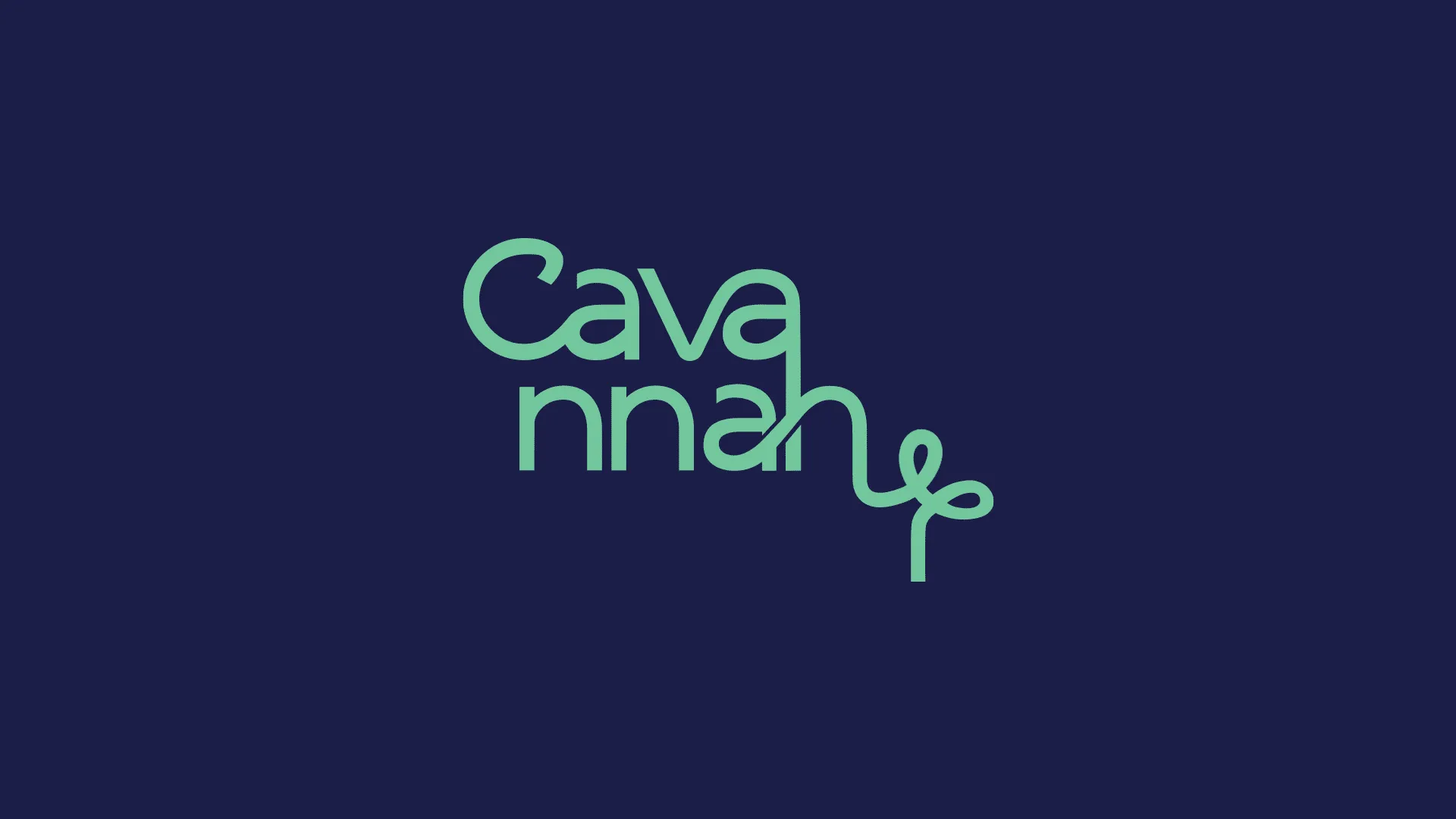
LekkiMedia
Refreshing the visual identity of a bold, modern creative house, preserving the signature mask motif and building a brand system ready to scale.
Balancing Brand Continuity
LekkiMedia, a creative house specialising in art, fashion, and design, approached Branxl Design to refresh its visual identity and develop a digital presence aligned with its bold, modern aesthetic.
The project covered a full rebrand including logo redesign, typography, colour system, and a UI/UX overhaul of their website and digital platforms. The goal was to balance brand continuity with a contemporary look that would resonate with creative professionals and forward-thinking clients. Every touchpoint needed to reflect LekkiMedia's artistry and its niche in fashion and design.
How We Built LekkiMedia's Identity
Palette Built for Impact
LekkiMedia's visual identity is anchored by high-contrast colours and strong typographic choices that communicate confidence, creativity and cultural edge across every touchpoint.
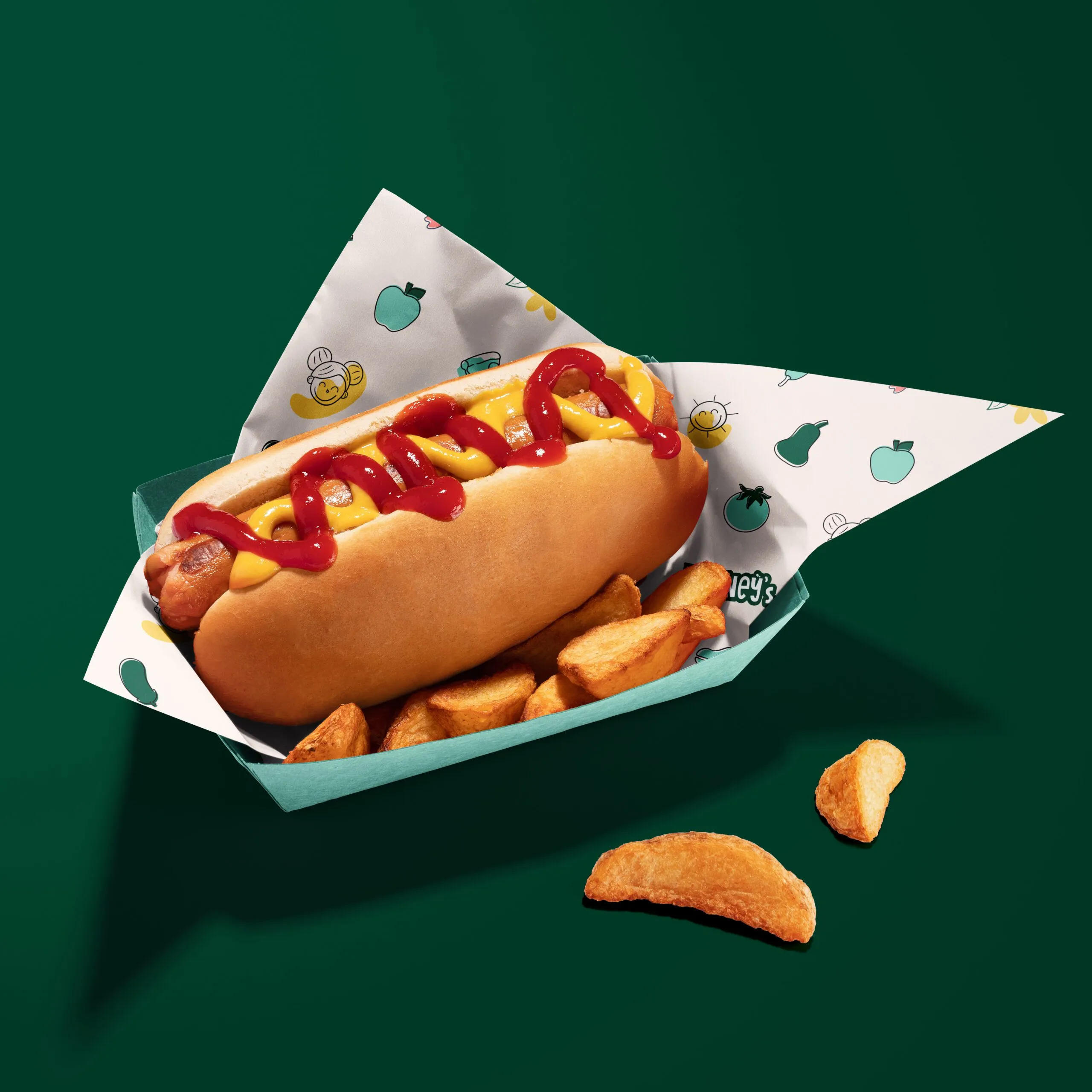
Brand photography & mock-ups
Branxl Design transformed our brand identity completely through a strategic and creative approach. Their attention to detail exceeded expectations, and the new branding has significantly strengthened our market presence, credibility and customer recognition across key channels.
Build a Brand That Commands Attention
We create bold, strategic brand identities for creative businesses ready to lead their industry.